Adam Hugh• Summer 2024
Adam Hugh (@adam__hugh) is an illustrator and graphic designer born in Mississauga, Ontario, with a unique blend of Chinese and Jamaican heritage. Their creative journey is deeply rooted in their multicultural background, which reflects in their work's diverse and vibrant aesthetic.
Drawing inspiration from the natural world and the bustling cityscape, Adam's style combines elements of nature with bold, vivid graphics. Their art bursts with color and energy, capturing the essence of the world around them in every stroke.
When not immersed in the creative process, Adam enjoys exploring the culinary scene of the city, seeking out new restaurants to try or experimenting with flavors in their own kitchen. Baking for friends and family is a passion that allows for a complete artistic break from time to time.
Through their art, Adam tries to bring a pop of vibrant colour into everyday life. Each piece they create is made with the hope that it will brighten someone's day and inspire someone else to do the same. Discover more about Adam’s creative process and his inspiration our sit down interview.
Can you share a bit about your background and how your multicultural heritage influences your art?
My background influences my art in my colour choices. My mom is Chinese Jamaican and I love to use bold bright colours from my summers spent in Jamaica with my family. It's such a vibrant environment that helps me to see the world in vivid colours.
What initially drew you to the world of illustration and graphic design?
I always loved to draw as a kid and that creative passion stuck with me through my school career. I was drawn in more and more to graphic design because of its ability to tell stories through colours and shapes that were more graphical than actual storytelling. I also think that having both illustration and graphic design skills has influenced my art style in many ways. I love telling stories through packaging and brand design.
Travel Adobe series by Adam Hugh
How would you describe your art style?
My art style is always evolving and changing from inspirations from the real world and other artists I see. Right now it’s a mix of art deco meets modern vibrant colours. I love the textures of old posters and papers from the art deco era and I love combining the washed out pastel colours with bright graphic line work that sits on top.
How long did it take you to develop your current style?
It’s still always changing but it definitely took a while for me to develop something that I was really happy with. I think it's always challenging to keep and develop a consistent style through different mediums. From paper to paint to digital forms of art there’s so many different ways to create something so I think that was a big challenge for me to overcome. I love to draw a certain way and paint a certain way but how do I translate that to a digital space? And this is what I landed on.
Can you describe your process for creating a new piece of art from start to finish?
I always start with as many sketches as I can. Usually on paper or digital sketching. Whatever helps me get out as many ideas in a short amount of time. I never sit with an idea for longer than five minutes until I’ve exhausted my brain. Then refining the sketches and creating colours roughs so I can get an idea for the colour palette and how it affects the focal point of the viewer. From then its line art and rendering out the piece until it's something I can be proud of.
What are the important tools you use in your daily work?
I love to sketch on paper and recently I’ve been exploring with paint markers which creates a very vibrant look.. My bread and butter for digital art is my iPad with Procreate. It's such a versatile software for realism and graphic digital art. I also work in adobe illustrator for my day job, creating a variety of digital media in vector format.
What's your dream client or project?
My dream project would probably be an entire brand identity project. I love creating design briefs and templates. Coming up with a whole brand from conception to reality is a dream. From logo to colours, to internal material, I love all the technical work behind it. There’s so much thought and consideration that can go into every little detail to make a brand visually shine.
Who is your biggest inspiration or illustration idol?
I have so many inspirations and artists that I’ve followed for years. Janice Sung (@janicesung) who did a previous menu design for demetres has been a long time inspiration. But I think someone who’s work and style is so visually stunning is Monica Ahanonu (@monicaahanonu). Her work is the most vibrant and fun. She mixes fashion illustration with bright colours and graphic linework that makes for such a playful style.
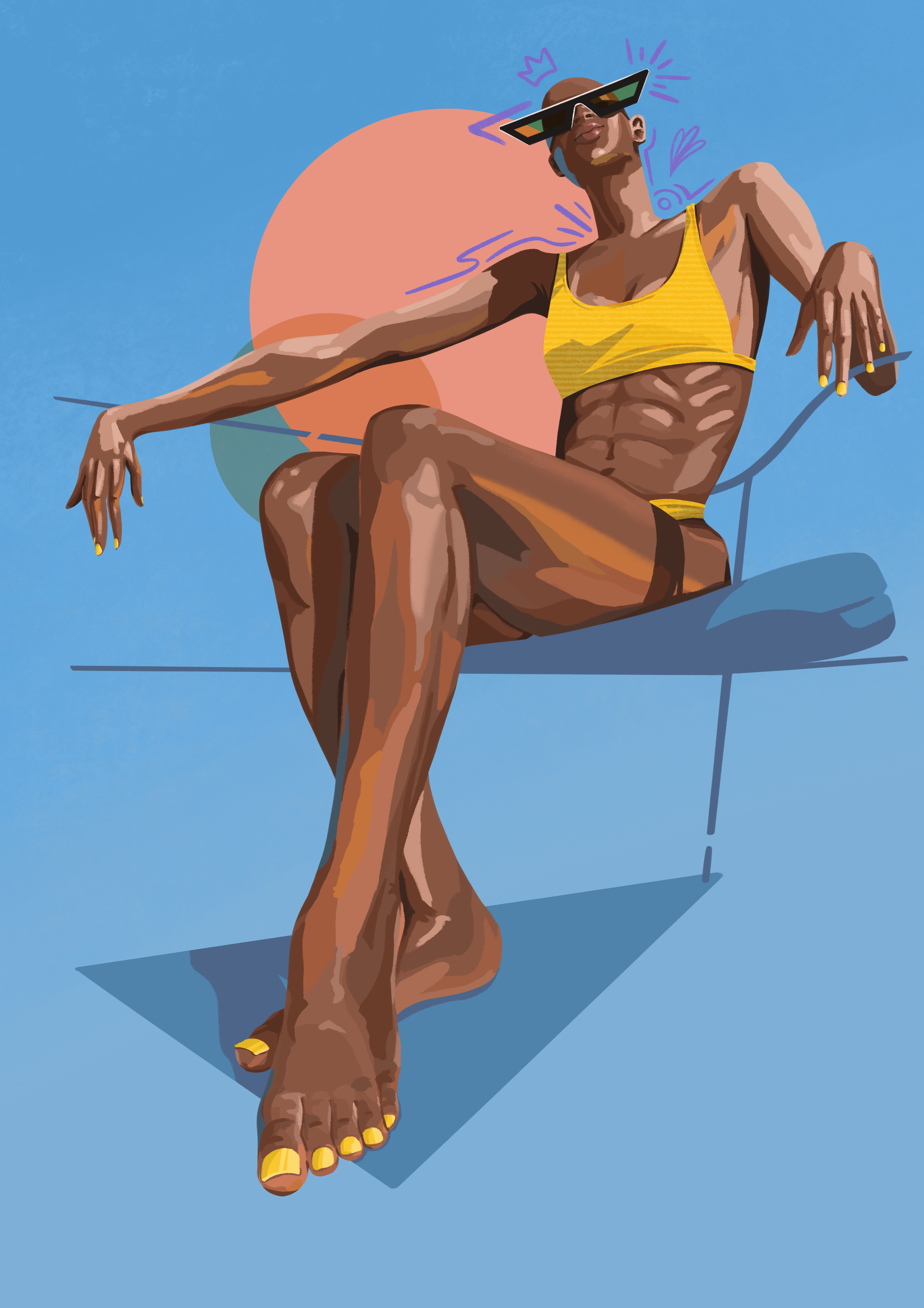
Artwork by Adam
Which of your work is your favourite so far?
One of my favorite works is actually a collection of sketches I did of IKEA plastic flowers. There wasn’t a deep meaning behind them. I just thought they looked pretty and wanted to render them in a traditional pencil sketch style. I love how delicate they turned out and I also created animated versions with a short wind cycle that makes them so peaceful to look at.
Can you tell us more about your inspiration behind the 2024 Spring Menu art and what messages you wanted to convey?
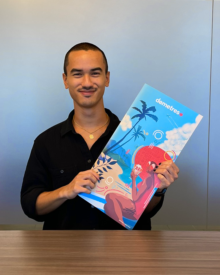
I definitely leaned into the summer vibe for this cover. I wanted it to be about the feeling from eating these amazing desserts and being transported to a beach somewhere warm with the sun shining. I love summer and the happy feeling the sun brings with it and I wanted to channel that in the menu cover.
When you’re not working, what do you enjoy doing most in your spare time?
I love food and I love trying new restaurants around the city. Even dining alone! I love listening to a podcast or some music and just people watching while I get to try something delicious. My google maps list has over 300 places tagged that are on my list to try so I definitely have my work cut out for me. And when I’m not drawing or eating I also like to bake at home. Breads, cookies, cakes, pies, I honestly love baking anything that could be a challenge and sharing it with friends and family.
Baked goodness by Adam
What's your ideal creative environment? Do you listen to anything in the background - music, podcasts, movies? Do you have favorites that you recommend?
My ideal environment can be anywhere! Indoors or outdoors. I love to listen to music and podcasts when I work. When I’m really trying to focus and meet a deadline it will be much softer background music but I’ll enjoy something more upbeat or a funny podcast when deadlines aren’t too aggressive. One of my favourite recent artists to listen to is an Icelandic artist named Laufey. She’s a genZ meets jazz and I couldn’t even tell you why I love it so much but I do.
If you can give a piece of advice to anyone new in the industry what would it be?
When people who are new to the industry or are exploring the thought of being an artist ask me for advice I always tell them to be open to new possibilities. I think a lot of artists come in with a specific mindset of what they want to do as an artist and I think it’s so important to be open to explore anything. I went into the industry with the sole goal of being a concept artist only to realize three years into college that I don’t actually like making concept art and I’m actually quite bad at it! It’s also so much fun to be fluid in what you do because it lets you work on a huge variety of projects. I love being able to pick up different types of work and explore more about myself and my art.


