Chris Sisti• Spring 2023
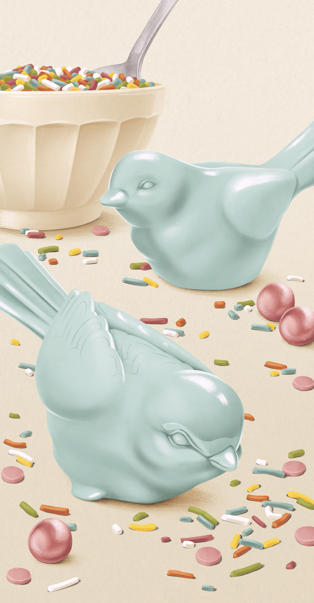
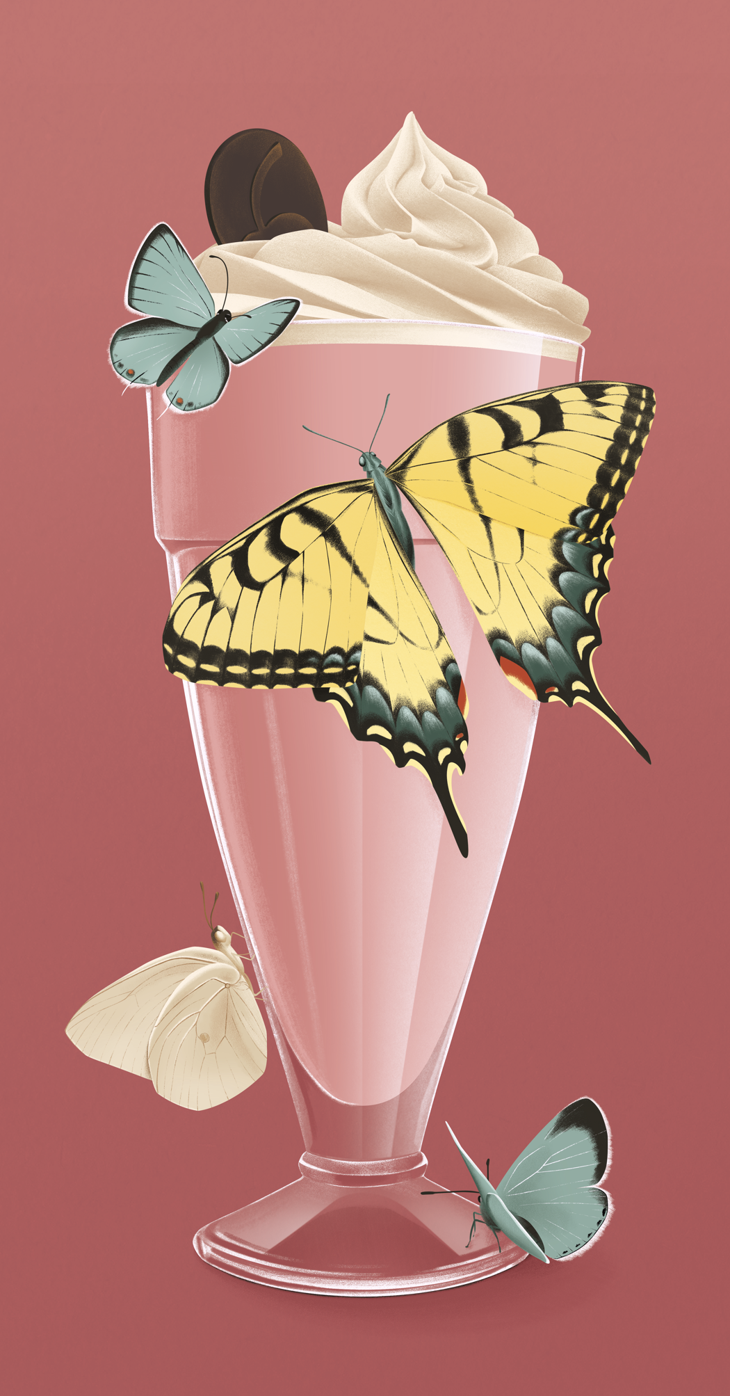
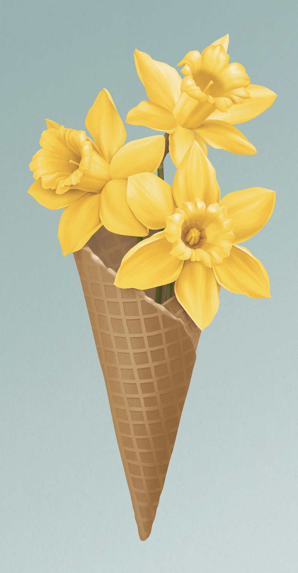
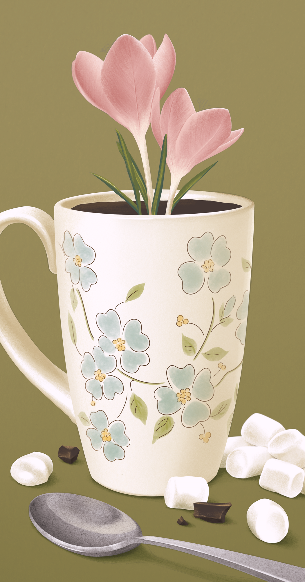
If you stopped by a Demetres recently, you might have noticed the stunning artwork adorning our Spring 2023 menu. We’re excited to introduce you to Chris Sisti, the talented artist behind the art.
Not only is Chris a talented illustrator, she has also expanded into sign painting and gilding - which is a perfect medium for her retro-inspired art style.
From her home studio in Windsor, Ontario, Chris talks about her art journey so far and her process in creating the lovely art for our spring menu.
Hi Chris, tell us a bit about yourself and your art journey so far.
Hello! I’m a freelance illustrator, artist, and traditional sign painter currently living in Windsor, Ontario.
Growing up I never really knew what I wanted to do in life. I love art and making things. In high school I was pushed towards graphic design, and from there I was inspired to specialize in illustration. I love doing a variety of things: illustrating, painting fine art, designing with type, building things by hand.
I’ve always been inspired by all things vintage, from motel signs and old matchbooks to travel posters and botanical illustrations. There is something to vintage things; a charm. I like to combine traditional mediums with the digital world using limited colour palettes to give my illustrations a retro feel.
Over the past few years, I’ve been expanding into sign painting and gilding, experimenting on various surfaces and at various sizes. Eventually I would love to learn silvering as well to create hand painted reverse-glass pub-style mirrors.
What sparked your interest in illustration?
Ever since I was little, I have always loved art and making things. I would spend hours drawing and crafting. When I went to college for Graphic Design I had a fantastic professor, Mike Lovell, who encouraged me to further my education in illustration. From there, I applied to Sheridan College, and began my art school journey.
How would you describe your art style?
My work is often described as ‘whimsical’ and highly detailed. It is vintage-inspired with muted and limited colour palettes. I like to combine flat graphics and fully rendered illustrations with clean lines and precision, like that of vintage travel posters and advertisements.
How long did it take you to develop your current style?
It took quite a few years, and is constantly evolving. For years growing up I took art classes with a local watercolour painter, where I gravitated towards realistic and fantasy painting. After high school, I went to college for Graphic Design where I started to love typography and design, and I started to learn digital painting (I cringe at my work from those first 3 or so years). After college, I went to Sheridan for Illustration, where my style really started to form from combining skills I have previously gained, and new experimentations.
Select artwork by Chris Sisti
How would you describe your experience in art school?
Art school was all of the things: fun, tough, exhausting. The work was challenging and extensive - I spent many all-nighters in the labs. It was great being immersed in the art school culture with so many like-minded individuals. The community within art school alone is amazing and something I will always cherish.
What are the important tools you use in your daily work?
I’ve been taught always start with a pencil and paper. It can be daunting, but I think that’s probably the most important.
From my pencil sketches, I vary between using my computer and my iPad for quick colour roughs. Once those are decided and I begin working on the finals.
I like to combine traditional with digital, so I will often paint my textures and details separately in watercolours and scan them in at high resolutions. The majority of my work is done using my Wacom tablet in Photoshop.
For personal work, I paint in watercolours on heavy hot press paper or with acrylics on wood panels. Lately I’ve been expanding further into traditional sign painting, painting with oil-based paints, and water gilding with gold on glass.
Can you talk a bit more about your process in creating your art? How do you achieve the realistic lighting and shading on the ceramic birds and the cherries?
I use limited colour palettes, so each individual illustration is roughly only three to six colours, painted one colour at a time. Similar to how I work with traditional watercolour, I digitally paint in layers. For instance, the ceramic birds were painted with a blue base. Large shadows were added with a medium blue, and detailed shadows were further added with the darker blue. I then added some highlights in a lighter blue, and brighter highlights in white.
Demetres Spring 2023 Menu Artwork by Chris Sisti
Have you ever run into an artist’s block? If so, where do you turn to for inspiration?
For sure! I like to hope it’s pretty common. When this happens, I like to step away. If I can go for a walk or go out and grab a coffee, that helps a little. What works best for me is going for little hikes in nature, or going to small nearby towns (if I can) and exploring small local shops - really anything to get out of my head and experience something a little outside of my day-to-day.
What's your dream client or project?
I would love to paint a large mural of my own design in a mural festival. I partook in a Walldogs event last fall in The Dalles, Oregon where I helped paint a mural and fell in love with it.
Who is your biggest inspiration or illustration idol?
I find my tastes and interests constantly evolve. For illustration, I love Teagan White’s macabre sombre pieces, and Benji Davies and Kim Leow’s more playful styles.
For fine art and mural artists, Leon Keer and Mona Caron are amazing!
Clockwise from Top Left: Select Work by Teagan White, Mona Caron, Leon Keer, Benji Davies
Which of your artwork is your favourite so far?
My favourite illustration piece I’ve created so far is called Toxic Beauty. It’s an illustration of a black butterfly landing on an azalea. It was for Light Grey Art Lab's Minneapolis gallery’s 100th and final exhibition entitled “The End is Nigh: A Curious Look at Death”, exploring the theme of death across history and culture.
Toxic Beauty by Chris Sisti
Can you tell us more about your inspiration behind the 2023 Spring Menu art and what messages you wanted to convey?
For the 2023 Spring Menu, I wanted to combine the feeling of newness that comes from spring with ice cream. After the cold darkness of winter, spring makes me think of growth, soft colours, and especially fresh flowers.
When you’re not working, what do you enjoy doing most in your spare time?
I love to travel and explore new places - if it involves being on a sailboat or with animals, that’s even better! I spend most of my spare time jumping from project to project. When I’m home, I like to read and bake, and in the summer, roller skating.
What's your ideal creative environment? Do you listen to anything in the background - music, podcasts, movies? Do you have favorites that you recommend?
I have to have something playing in the background, more often than not it’s a podcast or a sitcom from the 80s or 90s. I vary with which podcasts I listen to, but my go-to podcasts are The Last Podcast on the Left and Dumb People Town. Lately I’ve also been streaming trials on Youtube as well. During this project, I have been able to watch the entire Alex Murdaugh murder trial on Emily D. Baker’s Youtube channel.
If you can give a piece of advice to anyone new in the industry what would it be?
Don’t give up. There will be tough times and self doubt. Keep going. Don’t give up.


