Emily Taylor • Summer 2018

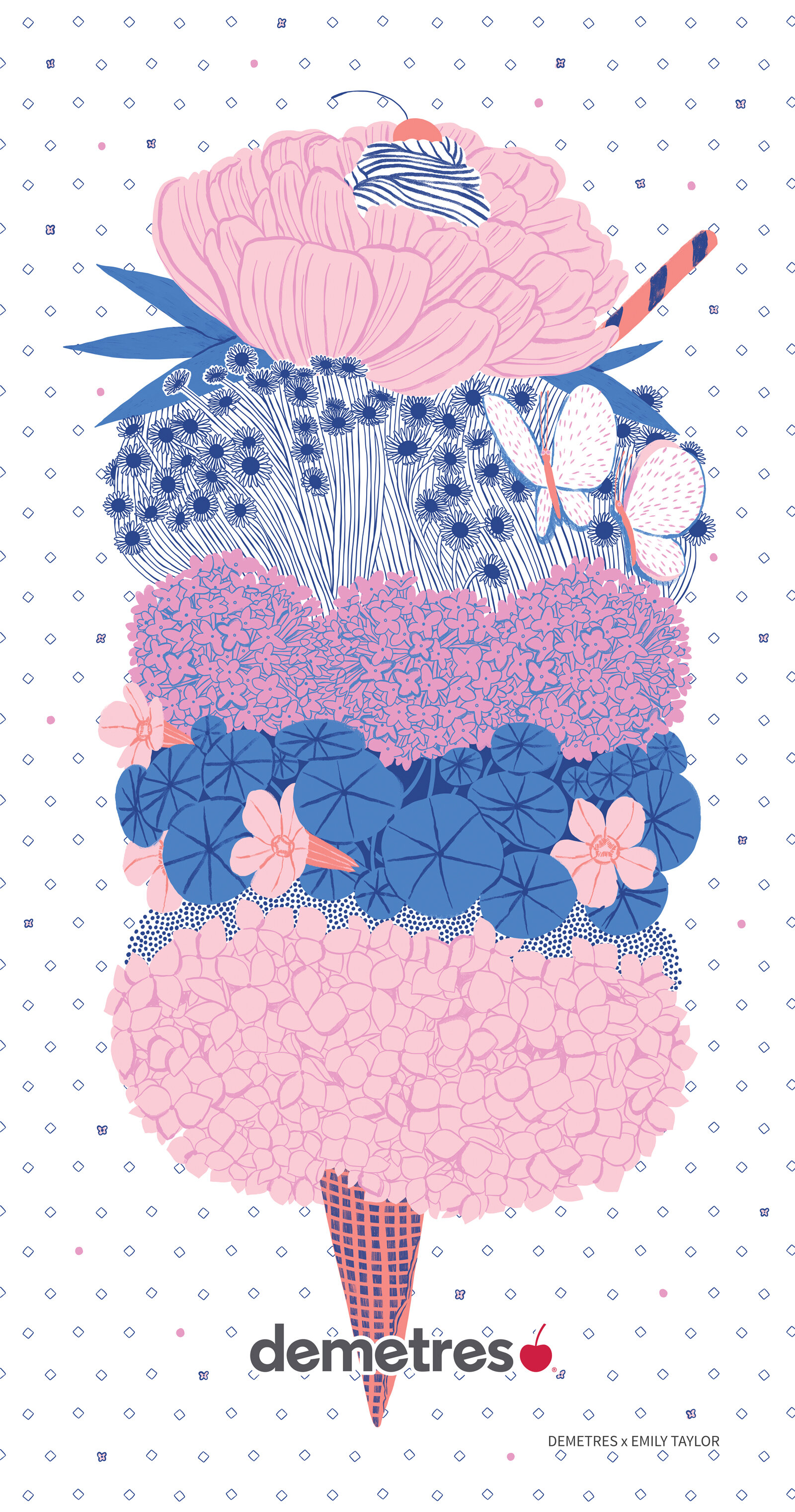
With the weather yo-yoing between dry sweltering heat and chilly rainy days, it’s hard to commit to a summer frame of mind. But we’ve got an ace up our sleeves: our latest summer menu cover by Emily Taylor is sure to inspire thoughts of warm summer nights full of fragrant floral blooms, and strolls with an ice cream cone in hand. We recently sat down with Emily to find out more about her work and her journey as a freelance illustrator. Read on!
Hi Emily, tell us a bit about how you got started down the path of illustration.
I’ve always been drawing. There are photos of me drawing on the floor with crayons before I was even walking; it is something that comes naturally and is second nature. Originally I entered OCAD for photography – it never occurred to me that I could make a living drawing. Fine art drawing and painting did not seem commercial and did not seem like a way I could make a livelihood; it was only there, at OCAD, when I was surrounded by students studying design, that I could keep on drawing through illustration. Illustration was commercial and there were jobs out there. With that dawning realization, I switched faculties and programs halfway through first year and happily never looked back.


After OCAD, did you jump into freelancing straight away?

I did! The first few years out of OCAD I worked some part time jobs, and then made the leap to full time freelance work. There are a lot of late nights and it is a constant struggle find that work life balance, especially with a home studio, where it is hard to separate yourself from the work. However, I love what I do and if I am honest with myself, if I am not drawing for a job, I am drawing anyway for fun, or for my stationery company Cabin Journal. I don’t like sitting idle and find I always need to be doing something, making something, planning a project, sketching…
How did you come to develop your style?
It has been a mix of inspirations. Vintage children’s books with their patterned end papers have always been influential stylistically; likewise vintage cook and baking books with their simple spot illustrations scattered through. In third year at OCAD I had an illustration class with Gary Taxali; he pushed us towards using a limited palette to dynamic effect and nostalgic tone, and I have to thank him for it. To this day I find myself trying to keep to less than 6 colours in illustrations – though if I recall, his rule for us was 4 and under.

Would you say that the limited colour palette is a significant part of your art style?
Hmmm… maybe? It depends. A limited palette has certainly helped for my work for Cabin Journal, where most of my products are screen printed or risograph printed and each colour requires a new layer, a new set up. It is just easier to work with less colours printing those ways. I also don’t like when things get really busy. I love old colour-lithographed illustrations with their colour overlays creating new colours, and I feel that you don’t need a lot of colours to create a beautiful image, a few will do.

What are your top 5 tools that you use as an artist?
Nothing too fancy for the most part! A mechanical pencil – the type that you would use for school. Sketchbooks, but nothing fancy… I still draw on printer paper a lot of times because I like being able to flip through the sheets really easily. Crayola markers, just kids markers, to help block in colour on a sketch sometimes. Then probably the tablet and my iPad Pro – those two are indispensable.

Where do you find inspiration for your work, especially when you run into artist’s block?
I have a bunch of vintage childrens’ books and botanical books that I reference. They provide a good starting point and help trigger a thought process or help me realize my next project. Sometimes I’m overwhelmed because I have so many ideas and it’s hard to pinpoint what to work on first.

I tend to find a lot of inspiration in nature, which does often come home with me. There are boxes of seashells, drift wood, and crab claws stacked here in the studio, and dried plants, alongside the living ones, all over the house. I find it difficult to find inspiration in the city. Maybe because I didn’t grow up here, but I find Toronto very grey, a sea of concrete and a forest of steel and glass. Fortunately my family has a farm and a lot of my family live in PEI, so between leaving the city for rural Ontario and PEI, I gather a lot of inspiration.
A fair amount of your work focuses on food, what drew you to illustrating them?
[Laughs] I think that’s still a big question for my parents. When I was a kid, my favourite toys were those plastic food toys with velcro – I was obsessed. If we went to a furniture store, I would be fixating on the fake food that’s on display in bowls… they probably thought that I was going to be a chef.
I think food is universally relatable. There is a personal draw to food, either through nostalgic memories or personal preferences. For stationery, for example, people see ice cream or cake and it’s just something that everyone seems to have some memories tied to, no matter where they’re from or what generation they grew up with.

If you’re looking to chill out here in Toronto, where do you go and what do you do?

I’ll wander up through Spadina’s fruit market stalls and sometimes into Kensington. I love vintage and find the St. Lawrence antique market a perfect hotbed of inspiration. Even just going to the west end – my risograph printer is out there – and walking through the treelined streets with the birds chirping and looking at the gardens lining the sidewalks is so refreshing. It feels like you’ve left the city, it has such a different vibe from the downtown.
Who would be your dream client for future projects?
IKEA would be really a lot of fun for surface design for textile and dishes, especially as they seem to be moving away from the primary colour palette they seemed tied to for so long, and are exploring new and more modern colours like pink and green.
I always thought Martha Stewart Magazine would be really great for editorial work, as well as Canadian Living, Frankie magazine, children’s books, and creative stationery companies like Red Cap Cards.

If you could give a piece of advice for someone who’s just starting out, what would it be?
There’s so much. But I guess I would say when you’re just starting out and you’re worried about not getting enough illustration jobs, just keep working on your personal work because often it’s the personal work that seems to bring in a lot of clients in the end. Always keep at it, you never know what potential clients are going to look at or what might inspire that email to come falling into your inbox. Be patient and keep going.
Out of design school, a lot professors advised us to send out promos to art directors and creative directors. That gets expensive fast, especially in the beginning when you haven’t had any illustration jobs yet to help pay for the printing and postage. Be more selective with promos – don’t go crazy sending them out to everyone; pick the clients that you really want and send them. I do not send promos out but find that posting on Instagram these days really helps with getting your work seen. You would be surprised who is looking.
Finally, a lesson I am slowly learning and a mantra I find I am often reminding myself. Don’t stress too much over your illustration jobs. Be professional, yes, and do your best with them. Things take time, and work might be slow the first few years, but you have to realize that it will not happen overnight and if you keep at it, people will start coming to you. Remember that you are blessed to be doing what you love, a luxury many people do not have. You are drawing for a living, and while it is hard and often riddled with self-doubt, it is rewarding in so many ways!
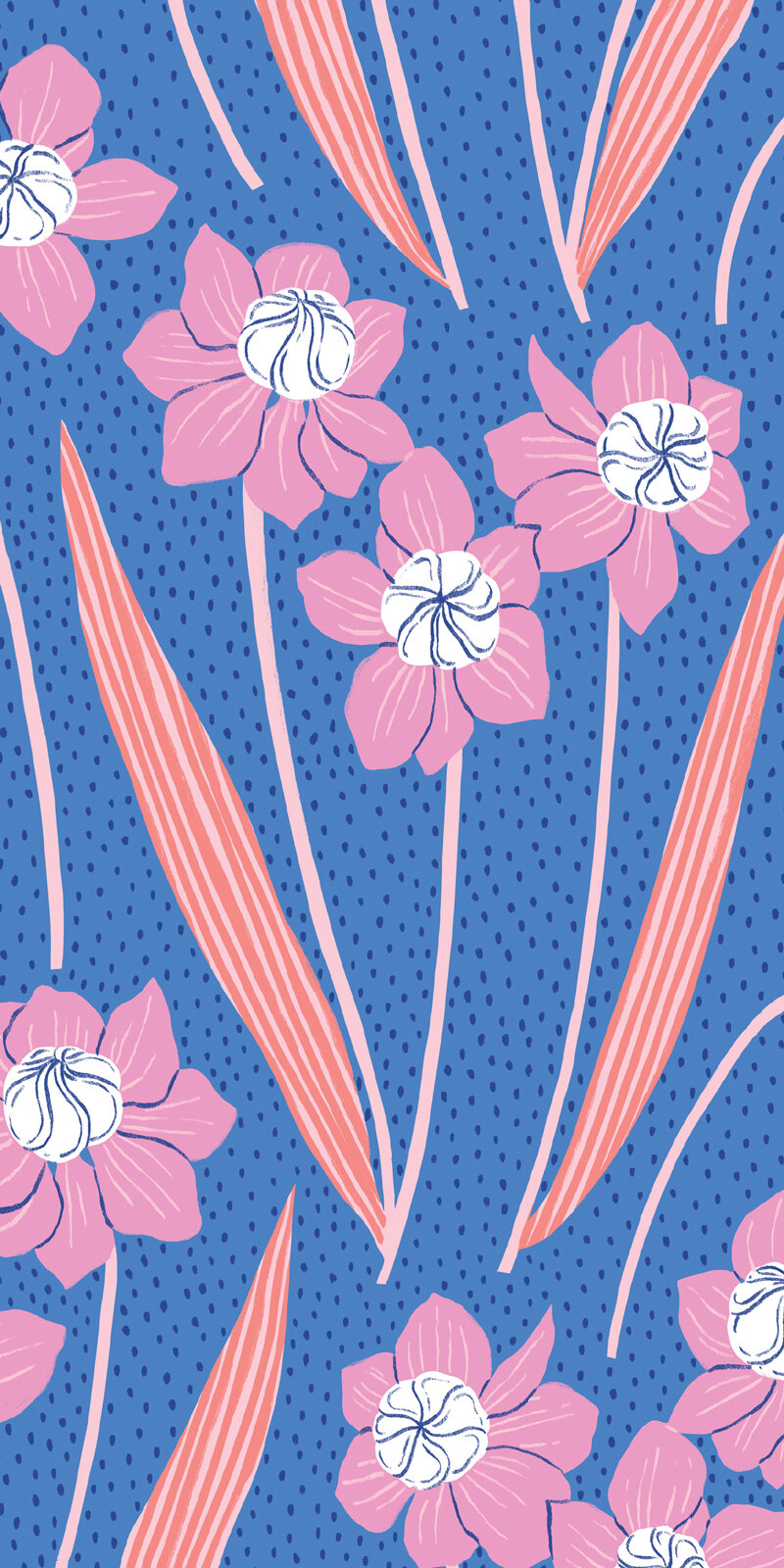
Here’s our Summer 2018 menu cover
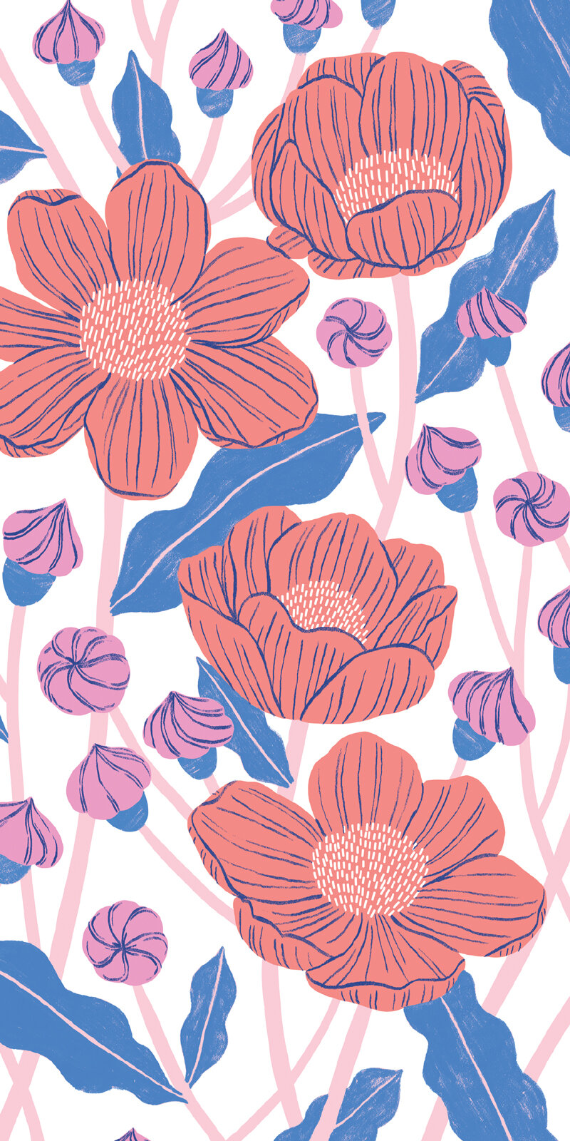
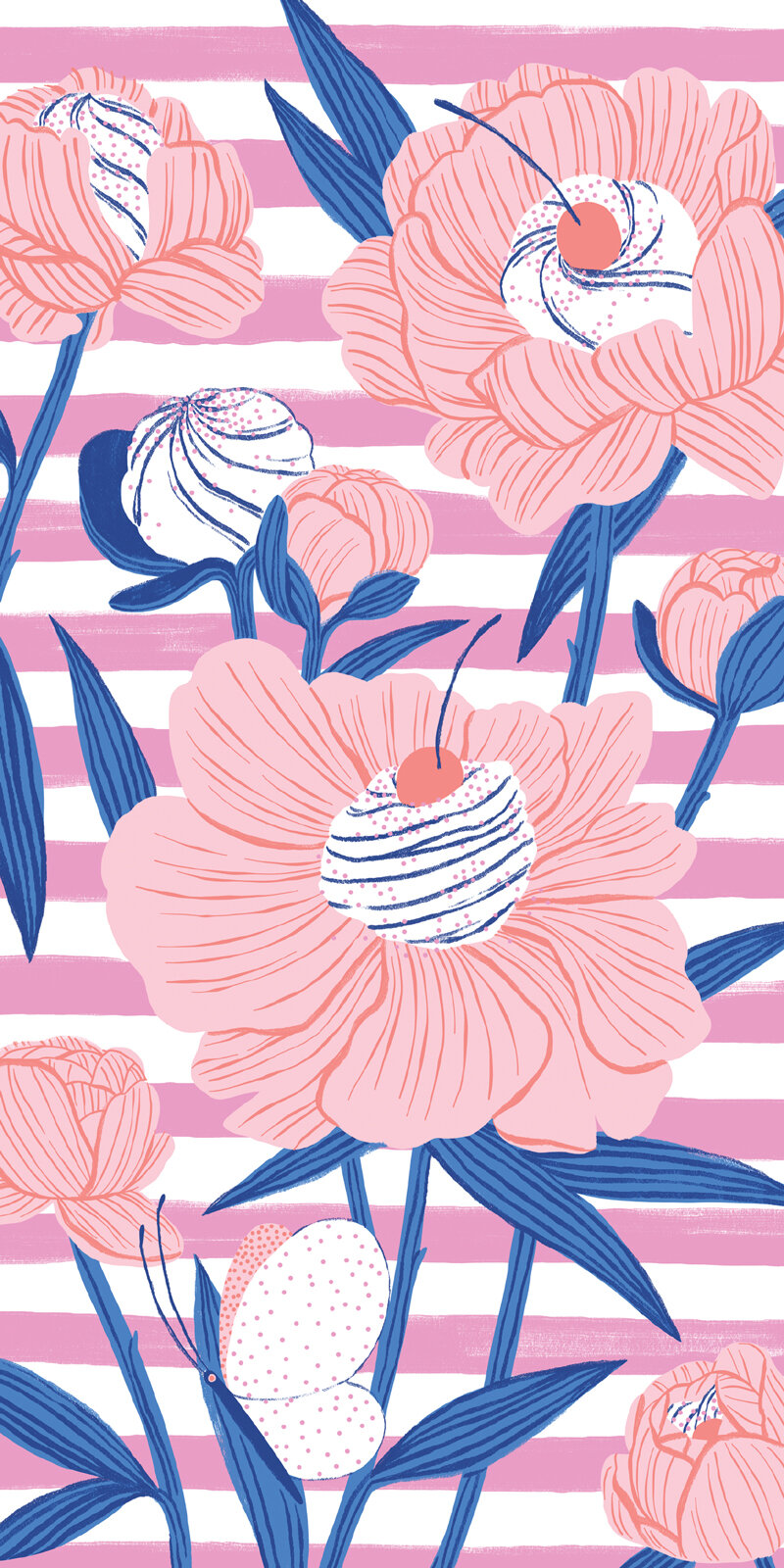
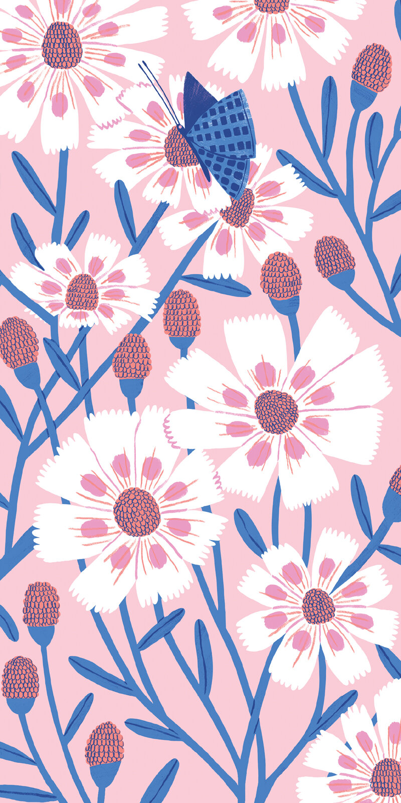
And the bill cards