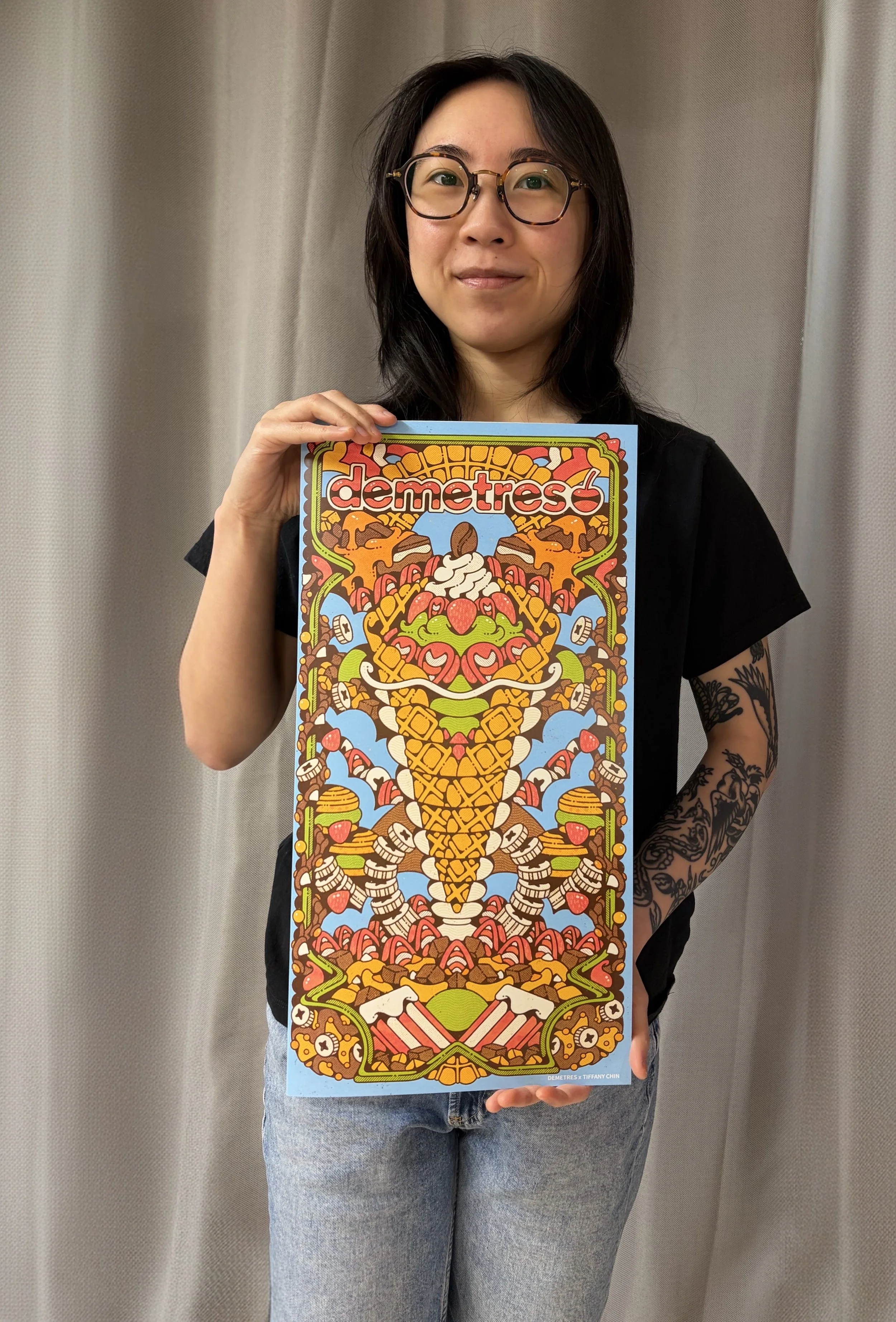
Tiffany Chin• Summer 2026
We're thrilled to introduce our latest menu artist, Tiffany Chin (@twkchin). Tiffany's bold, symmetrical illustrations are steeped in vintage poster art, 1960s and 70s psychedelia, and traditional tattoo styles, an aesthetic that brings a whole new dimension to the way our desserts are imagined.
This Toronto-based illustrator and OCAD graduate has built a reputation for richly detailed, surreal compositions packed with hidden Easter eggs, the kind of artwork that rewards a second, third, and fourth look. We recently sat down with Tiffany to talk about her creative journey, her process, and the inspiration behind the new Demetres menu art. Read on.
Hi Tiffany, tell us a bit about yourself and your art journey.
My name is Tiffany Chin and my work is inspired by vintage poster illustration, vintage advertisements, and traditional tattoo styles. Growing up, I drew a lot but never really considered it a career. I started at York University for criminology, but I quickly realized I was drawing way more than I was studying, so I dropped out and transferred to OCAD for illustration.
The program was rewarding and challenging in equal measure. More than the craft itself, OCAD taught me how to be self-reliant, self-motivated, and independent, which has been just as valuable as the technical training.
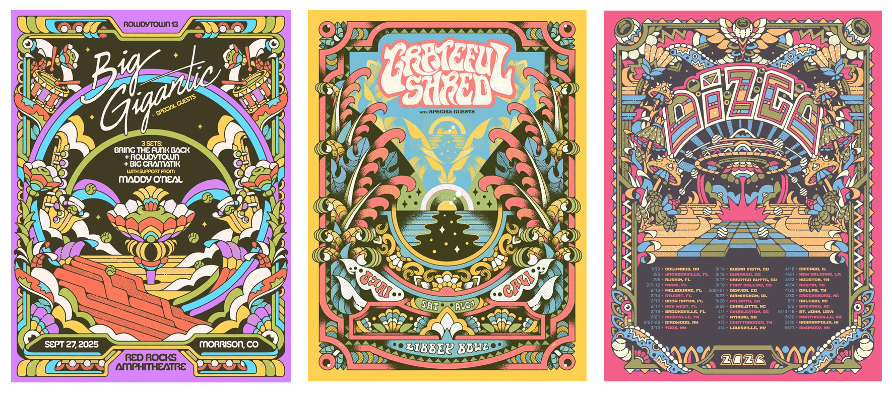
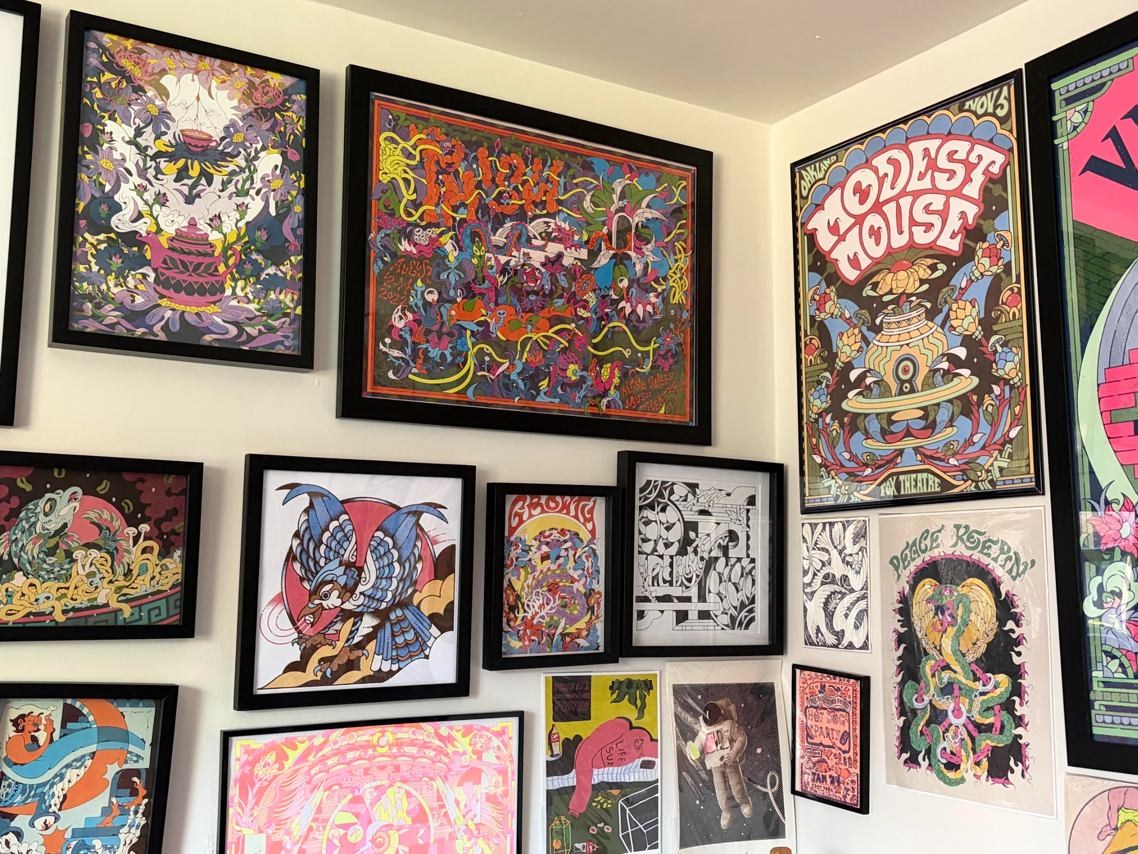
Select artwork by Tiffany Chin
What sparked your interest in illustration?
As a kid, I collected a lot of Yu-Gi-Oh cards. Looking back, I was really collecting little pieces of artwork. There's something so fun about pulling an idea out of your head and putting it onto paper, and that feeling never went away.
How would you describe your art style?
I've been told my work is psychedelic and surreal, and I think that's mostly fair, but honestly, I just go with the flow and let my brain take the artwork wherever it wants to go. I leave the final read up to the viewer.
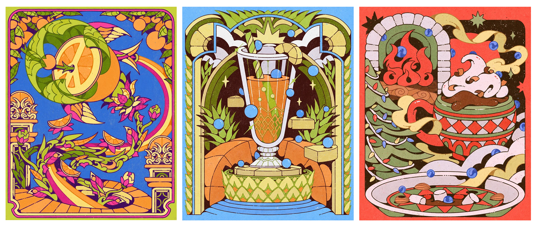
Select artwork by Tiffany Chin
How long did it take you to develop your current style?
I really landed on this style in my final year at OCAD. We were pushed to define a visual voice, and I kept gravitating toward vintage posters, advertisements, and the music of the 1960s and 70s. That decade became my biggest reference point. During one written assignment, we had to pull a piece from a textbook, and I came across a Victor Moscoso poster. The contrast, the colour, the chaos, it flipped a switch in my head and shaped everything I've made since.
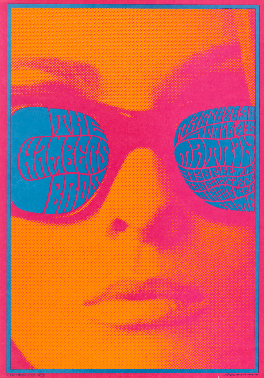
Work by Victor Moscoso
What are the important tools you use in your daily work?
Procreate, my iPad, my AirPods, and my brain. That's pretty much the whole studio.
Your work has this really striking symmetry and level of detail. Can you walk us through how you build those compositions?
It really depends on the client. I've been lucky to work with people who give me a lot of creative freedom, and in those cases I just go with the flow. When the brief is more defined, I start with research, the venue, the time of year, the seasonality, whatever the context calls for. Then I put on music and let it become a stream of consciousness.
For the symmetry, I rely on the mirror tool in Procreate to block things out, and then I draw all the details in manually. I love hiding Easter eggs. I want your eyes to bounce around the piece and keep discovering little things. That sense of discovery is the most fun part of illustration for me.
Have you ever run into an artist’s block? If so, where do you turn to for inspiration?
Oh, all the time. Artist's block is just a natural part of being creative. Sometimes I push through it, and sometimes I step back, go for a walk, look at flowers, or head to the record store and let something fresh wake my brain up.
With time, you become a bit desensitized to it. You start to know your patterns, and you learn how to navigate the next one. It's a very personal thing, and I don't think it ever fully goes away, you just get better at moving through it.
What's your dream client or project?
Pearl Jam or Paul McCartney. Bands and artists I really admire. I'd also love to work with Nike (I love sports, especially basketball) and the Raptors would be a dream. If I could pick the project, it would definitely be a poster, something promoting a show or event. I love a good challenge.
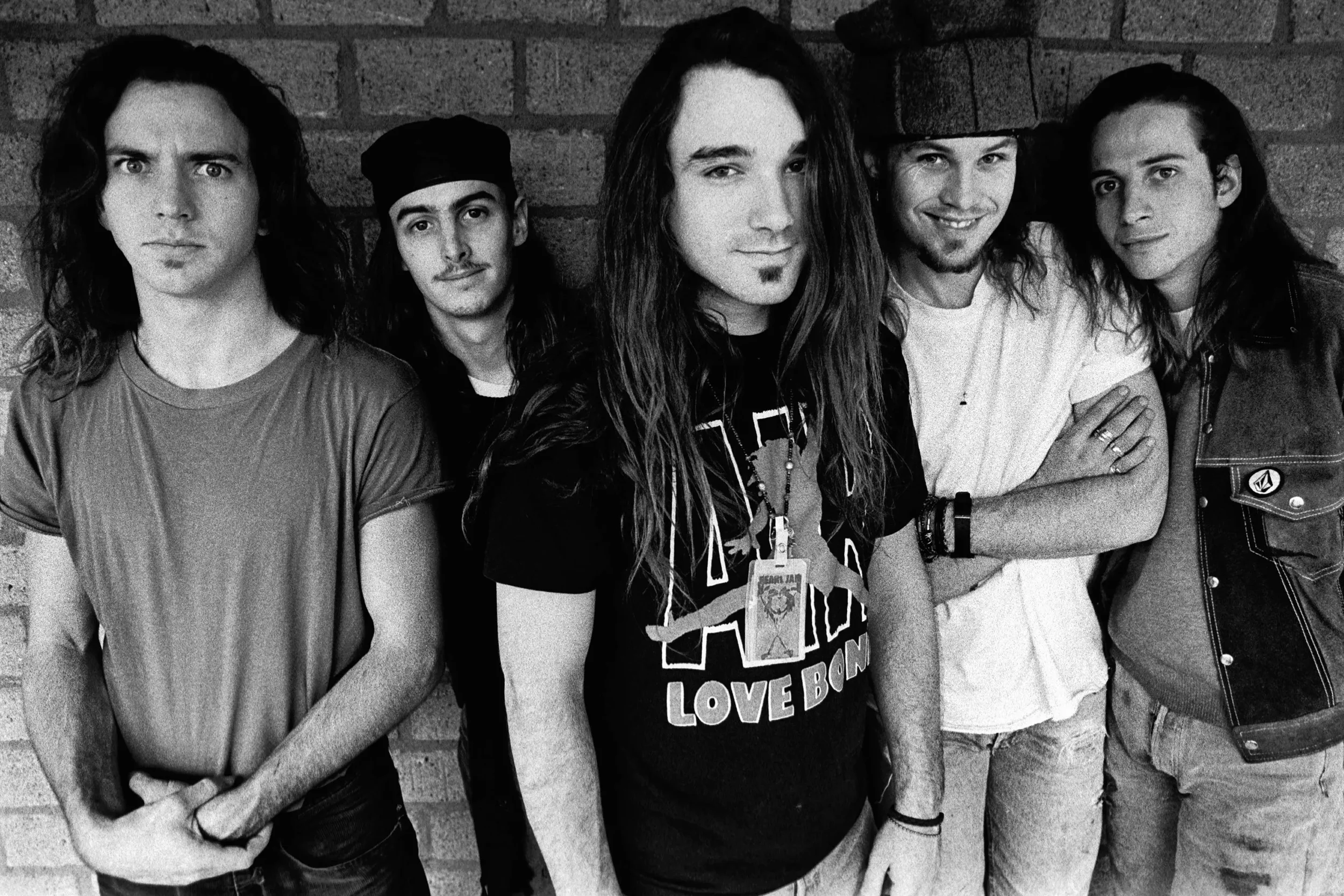
Pearl Jam

Paul McCartney
Who is your biggest inspiration or illustration idol?
Victor Moscoso is at the top of the list. Rick Griffin, who did so much of the Grateful Dead's iconic work in the 60s and 70s, is another. Milton Glaser, who designed the I ❤ NY logo, and his collaborator John Alcorn, whose graphic shapes are unmistakable. Those four are my north stars.
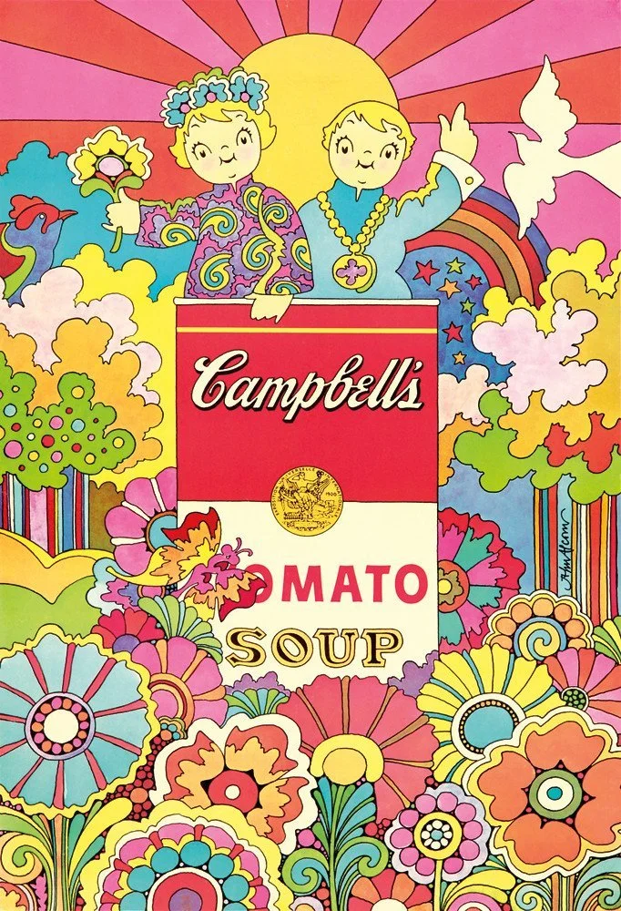
Work by John Alcorn
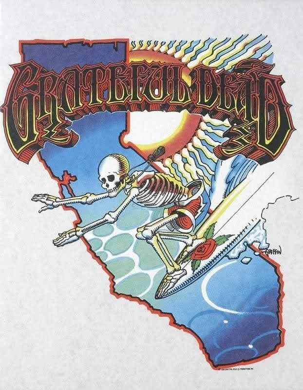
Work by Rick Griffin
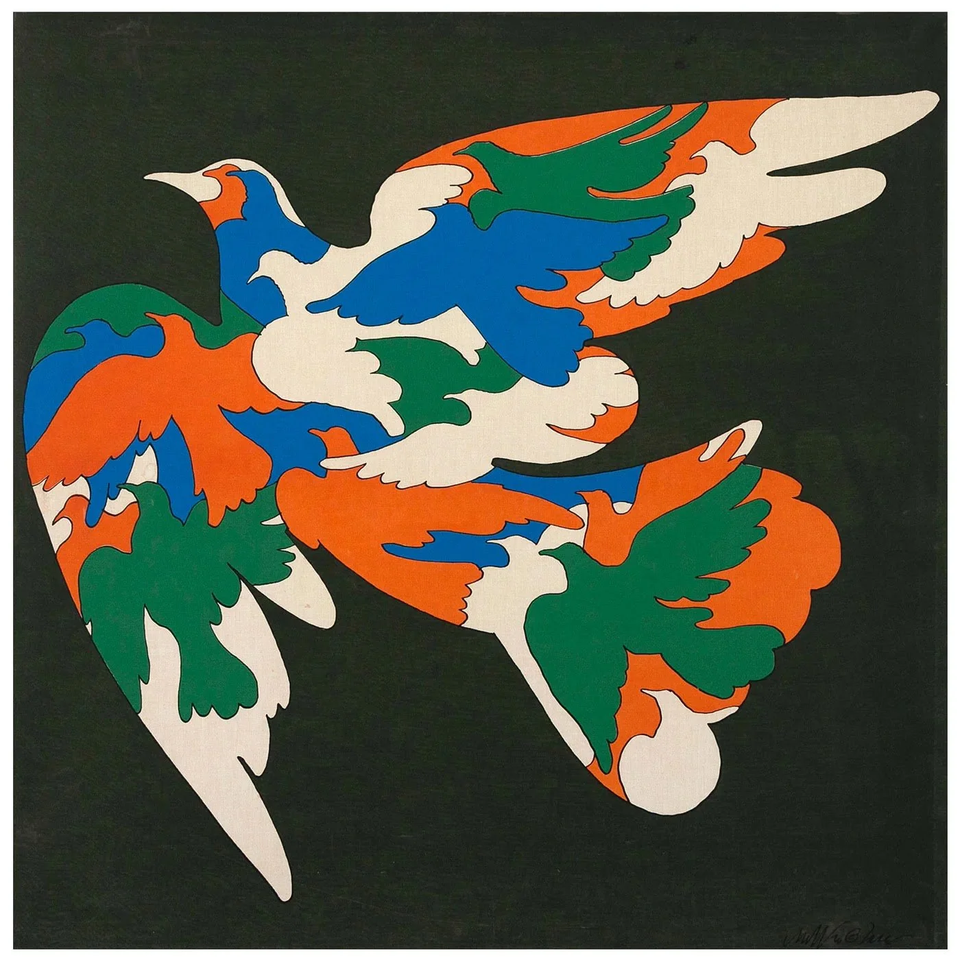
Work by Milton Glaser
Which of your works is your favourite so far?
A Billy Strings concert poster I did recently for his spring tour. It's full of Easter eggs, rabbits, caterpillars, plants, just so much to look at. The composition is calm and intricate, but slightly chaotic in the best way. Everything came together really nicely.
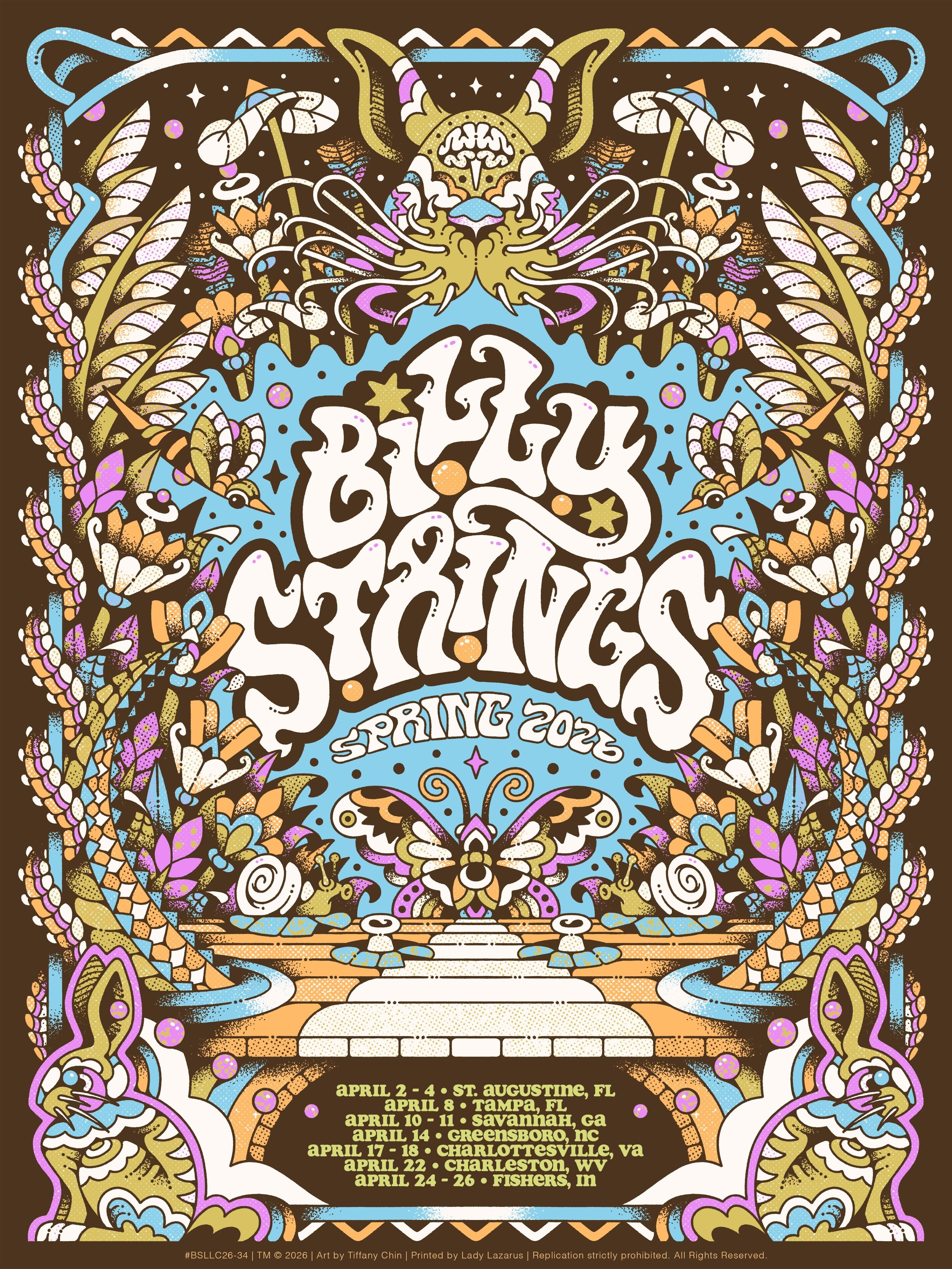
Billy Strings poster by Tiffany Chin
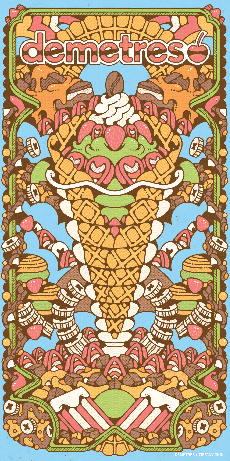
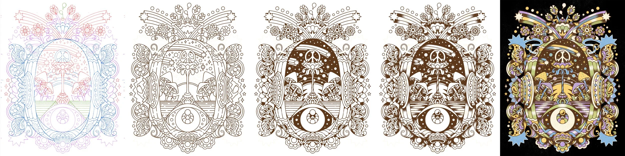
Can you tell us more about your inspiration behind the Summer 2026 Menu art and what messages you wanted to convey?
I really appreciated the creative freedom on this one. I wanted to do my own interpretation of the desserts and build an atmosphere that felt indulgent, slightly overwhelming, like a never-ending buffet. I'm always trying to reinterpret food in interesting ways, and psychedelic surrealism felt like the right lens for Demetres.
I started the piece, then went to the store, and then went back to my desk. Being in the space really helped, I got to feel the visual aesthetic and the interior design firsthand, and that made sure my work would actually live well inside the restaurant.
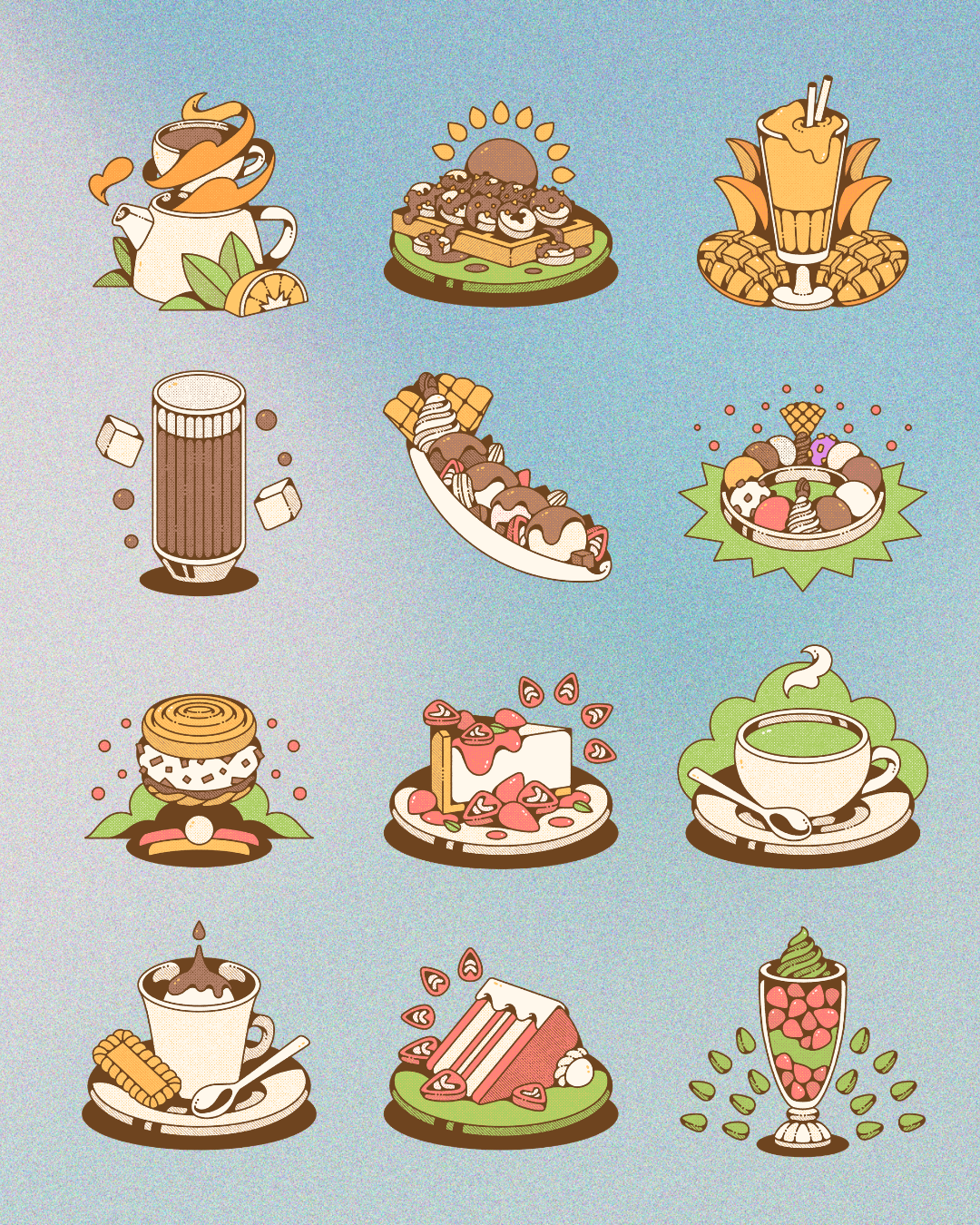
Demetres dessert spot drawings by Tiffany Chin
When you’re not working, what do you enjoy doing most in your spare time?
Lately I've been playing guitar. I'm self-taught, picked it up years ago, put it down to focus on art school, and recently came back to it. Having a creative outlet that isn't drawing has been so important. I'm working through some classic riffs right now (One of These Nights by the Eagles, and Here Comes the Sun by the Beatles). I'm not great, but it's deeply therapeutic.
Outside of that, I watch a lot of basketball. The Raptors, obviously, and our new WNBA team, the Toronto Tempo.
What's your ideal creative environment? Do you listen to anything in the background - music, podcasts, movies? Do you have favorites that you recommend?
Almost always music. I made a playlist called Waynestock, a mashup of Woodstock and Wayne's World, full of 60s and 70s tracks. I'll also throw on a food podcast (I'm currently into Is a Hot Dog a Sandwich? for the food debate of it all). I have something playing pretty much any moment I'm awake.
Coming out of school I had a studio space through the OCAD program, then another shared space after that. Both were right by Richmond Street, constant honking, people yelling, and I realized I needed silence to actually focus. Working from home turned out to be the right call. I have a small spare room (used to be a storage closet with cans of tuna) that I've slowly filled with posters and artwork I've collected over the years. It's predictable, quiet, and entirely mine, which is exactly what I need.
If you could give a piece of advice to anyone new in this industry, what would it be?
Keep drawing, and trust the process. Embrace your work and the journey it takes you on, even the parts that don't make sense yet. As a creative person who isn't necessarily working for anyone, it's really hard to gauge where you're going or how you're progressing, so resilience matters more than almost anything else.
Believe that you're capable of achieving whatever your goal is. Or, as Fred VanVleet put it: bet on yourself. I wish I'd heard that earlier..